
If you’re familiar with the power of the StoryBrand framework, chances are you can’t wait to apply the ideas to your business. Most importantly, you’ll want to apply the framework to one of the most important tools you have—your website!
But how do you build a StoryBrand website? Even though you may understand the ideas in theory, it can be difficult when it comes time to execute them—not to mention time-consuming. However, there are lots of experts who have crafted great examples of StoryBrand websites. For those that want inspiration and a little help, we’ve compiled a list of some of the best StoryBrand website examples.

If you’re familiar with the power of the StoryBrand framework, chances are you can’t wait to apply the ideas to your own website. But how do you build a StoryBrand website? Even though you may understand the ideas in theory, it can be difficult when it comes time to execute them. For those that want inspiration and a little help, we’ve compiled a list of some of the best StoryBrand website examples.
Here are five websites that show StoryBrand ideals well, what we like about them and how you can learn from their success.
For a refresher on what StoryBrand is and why it works so well, check out this awesome blog post on the topic.
StoryBrand Website #1: Emphasize the Benefits Front and Center

nGROUP Performance Partners | Designed by Well Dressed Walrus, in collaboration with Heights Strategic Marketing
When people hear about your business, there’s one question that’s always on their mind: What’s in it for me?
Clients want to know how your company helps them live a better life. They want to know about the benefits of doing business with you.
The mistake most business websites make is that instead of talking about benefits, they only mention features. All of that is just noise.
This is the old Apple vs PC parody. While PC talked about features (so many GBs of RAM and other technical things), Apple emphasized the benefits (use a Mac and you’ll look cool and creative).
First on our list of the best StoryBrand website examples, nGROUP (a company that helps with labor management) follows Apple’s example. Right away the viewer’s eyes are drawn to the text over the feature image. Anyone who visits the site will immediately know that nGROUP helps increase productivity and solve labor headaches. And that’s everything they need to know so far. It takes just ten seconds for them to read this headline and nod their heads. Then, they’ll keep scrolling.
To keep the attention of your audience, your site should do likewise and feature the benefits of doing business with you above the fold.
StoryBand Website Example #2: Make Your Call-to-Action Stand Out
Cervis Volunteer Management | Designed by Knapsack Creative
Once you hook viewers, your website should make it as easy as possible for people to do business with you.
The best way to do this is with a very clear call to action. It’s important that viewers can spot this button without burning many brain calories.
On this page for Cervis Volunteer Management, the call-to-action button is easy to find. The orange color stands out from the dark background and the text makes it very clear what will happen when clicked—you’ll book a free demo with them. It appears multiple times on the homepage alone—just like Cervis, you shouldn’t be afraid to tell your customers what to do!
Someone looking for a way to streamline their volunteer services won’t stall for a moment if they like what they see.
To bring people unhindered to your business, feature your call-to-action button immediately, prominently, and frequently.
StoryBrand Website #3: Overcome Objections to Doing Business with You
Speech Sisters | Designed by Kyler Creative
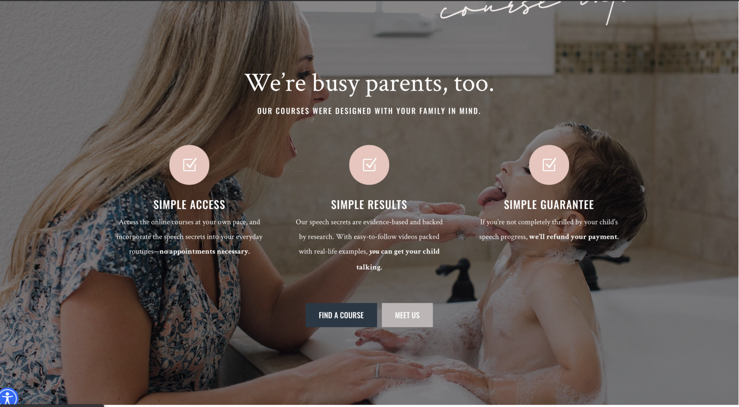
No matter how great your company, people will always have objections to doing business with you.
The best StoryBrand website examples anticipate these objections and ease the viewer’s worries. It’s like you’re a mind reader—you know your audience so well you know what’s going to make them say “no.”
This site for online toddler speech and language courses knows parents can feel overwhelmed by speech and language pathology. They might wonder if they can keep up with the courses or whether they’ll see results.
Speech Sisters reduces these fears with three guarantees: courses will be easy to access, will garner results, and are fully refundable if parents aren’t fully satisfied.
Between these guarantees and the empathy displayed in this block, viewers become comfortable signing up for courses. Do something similar to win over hesitant browsers.
StoryBrand Website #4: Borrow Authority with Customer Reviews
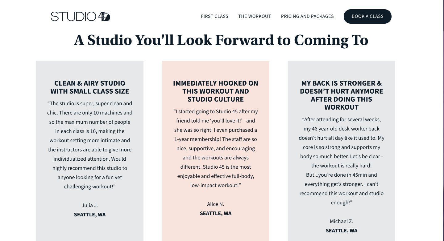
Studio 45 | Designed by Heights Strategic Marketing
If you’re familiar with StoryBrand, you know that your role as the guide requires empathy and authority.
But sometimes those qualities can be hard to convey without growing long-winded.
A great solution is to use customer reviews. Viewers will automatically trust people who are like them. Feature testimonials and stories of transformation and past clients will do the hard work of selling for you.
This site for Studio 45 features reviews from people passionate about their fitness. When a person sees another gym-goer grateful for the way Studio 45 has helped them get in shape, they’re going to want to know more. Plus, we love the way the testimonials are summarized in easy-to-scan headings.
If you want to earn trust on your website, make sure you feature powerful testimonials from previous clients.
StoryBrand Website #5: Clarify the Stakes — What if People Don’t Do Business With You?

Cutting Edge Catering | Designed by Sure Faze
While StoryBrand (and your customers) should focus mostly on success, you also have to remind your website viewers that your business helps them avoid failure.
People need to know what is at stake. What’s the cost of not doing business with you?
We love how clearly this website for a catering company spells out the stakes: late food ruins events. No one wants to experience that, and so they’re motivated to get a quote.
To include the stakes without being melodramatic, get specific in your copy. What one thing will happen if clients don’t use your business? And how will that failure make them feel? It doesn’t have to be dramatic—it could be as small as a minor inconvenience (late food.)
Communicate that well, and you’ll have new leads in no time.
The Secret to Putting These StoryBrand Website Tips Together
The best StoryBrand website examples offer great inspiration as you go to design your own site.
However, if you try to borrow from a bunch of different sources, your site might end up looking like a hodgepodge.
The secret to a StoryBrand website is clarity.
So as you use these elements and find inspiration, make sure that the narrative you’re telling is a cohesive whole. One element or website block might look great on its own, but if it doesn’t fit with the story your site is telling, it will only keep people from doing business with you.
If you want help putting together clear messaging and a website that gets you more clients, give us a call at Hughes Integrated. We’d love to help you apply StoryBrand principles to your business’ messaging and take your marketing to the next level.
